Creating a calm and inviting atmosphere in your home often starts with the colors you choose for your walls, furniture, and decor. Colors have a powerful impact on mood and can influence how relaxed or energized a space feels. If you’re looking to bring a sense of tranquility and balance to your living areas, selecting the right calm colors is key.
In this blog post, we’ll walk you through practical tips for choosing calm colors that suit your home and lifestyle, helping you create a peaceful haven.
Why Calm Colors Matter
Calm colors, often muted and soft tones, help reduce stress and promote relaxation. Unlike bright or intense hues, these colors support a serene environment, making them perfect for bedrooms, living rooms, or any space where you want to unwind.
Common calm colors include shades of blue, green, lavender, soft grays, and neutral tones like beige and off-white. Each color can evoke different feelings, so it’s important to understand their effects and how they fit your personal style.
Tips for Choosing Calm Colors
1. Consider the Room’s Purpose
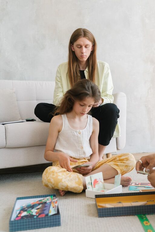
Think about how you use the space. For bedrooms or meditation areas, opt for soft blues or gentle greens, known to lower heart rate and promote sleep. In a living room, warmer neutrals or pastel shades can create a cozy and inviting vibe without overstimulation.
2. Test Colors in Natural Light
Colors can look very different depending on lighting. Paint samples on your walls and observe them at various times of the day. Natural light enhances colors softly, helping you identify which shades truly feel calm and pleasing to you.
3. Use a Neutral Base
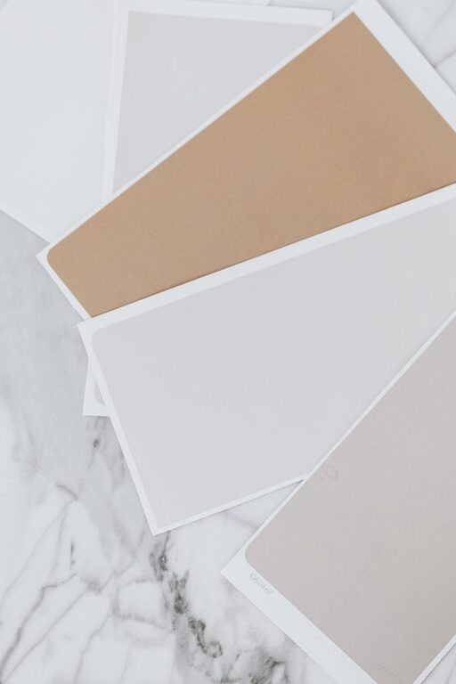
Starting with a neutral base like light gray, soft taupe, or creamy white allows you to add calm accent colors without overwhelming the room. Neutrals provide versatility and a timeless backdrop that supports relaxation.
4. Limit the Number of Colors
Too many colors can create visual chaos, undermining the calm atmosphere. Stick to a simple palette of two or three complementary colors. This approach maintains harmony and balance throughout the room.
5. Incorporate Nature-Inspired Hues
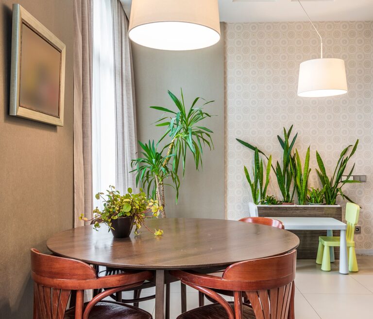
Colors found in nature are naturally calming. Think soft greens reminiscent of leaves, sky blues, or sandy beiges. These tones connect your indoor space with the outdoors, promoting feelings of peace and stability.
6. Balance Cool and Warm Tones
While cool colors are usually associated with calmness, including warm undertones (like a soft peach or muted gold) can add warmth and comfort without sacrificing tranquility. Balance helps the room feel welcoming and restful.
7. Use Matte Finishes
Choosing matte or eggshell paint finishes over glossy ones reduces glare and reflections, making colors appear softer and more soothing to the eyes.
8. Add Texture and Layers
Colors alone don’t create calm—they work best paired with texture and layering. Think plush rugs, linen curtains, or soft throw pillows in coordinating calm colors to deepen the sense of relaxation.
Popular Calm Color Choices and Their Effects
| Color | Effect |
|—————|—————————————————-|
| Light Blue | Calms the mind, promotes serenity and focus |
| Soft Green | Refreshes and harmonizes, reduces anxiety |
| Lavender | Encourages relaxation and restful sleep |
| Warm Beige | Creates a cozy, inviting space |
| Pale Gray | Offers neutrality and balance without dullness |
| Creamy White | Brightens the room gently, maintains softness |
Mistakes to Avoid When Choosing Calm Colors
– Overloading with Pastels: Too many pastel colors may feel juvenile or overly sweet. Balance them with neutral or earthy tones.
– Ignoring Undertones: Paint colors often have warm or cool undertones. Mixing clashing undertones can disrupt the calm effect.
– Forgetting Furniture and Decor: Walls aren’t the only consideration. Ensure your furniture, fabrics, and accessories coordinate seamlessly.
– Neglecting Personal Preference: Trends are helpful but your comfort matters most. Choose colors that genuinely make you feel relaxed.
Final Thoughts
Choosing calm colors for your home is a thoughtful process that blends aesthetics with wellbeing. By considering the room’s function, testing colors in natural light, and keeping the palette simple and nature-inspired, you can create peaceful spaces that support your daily relaxation and comfort.
Remember, calm doesn’t mean boring—it means creating a balanced environment that feels just right for you. Enjoy the process of making your home a tranquil retreat through the power of color.
About the Author